To work with your data in tandem with RDS analysis, the software offers plotting tools under the Plots menu.
Creating a plotting system that is useful for both beginners and expert is a difficult challenge. Expert users desire a diverse set of graphics, and fine control over the display parameters. Beginners just want an easy way to create standard, tried and true, plots. The plot builder attempts to satisfy both of these requirements within a single interface.
The fundamental model behind building plots is the grammar of graphics, as implemented by the ggplot2 package. Much of the documentation of the ggplot2 package is relevant to the components of the plot builder. You can learn more about ggplot2 here.
The huge advantage of the grammar for a GUI is that though there are a finite number of components, almost any possible statistical graphic can be produced. Leading to a hugely flexible tool. With this flexibility comes the cost of complexity. To mitigate the impact of this complexity on beginners, the GUI introduces a new concept, Templates, to assist new users.
If you were left scratching your head when the "grammar of graphics" was mentioned, don't worry. Many standard statistical graphics can be produced without needing to know about it.
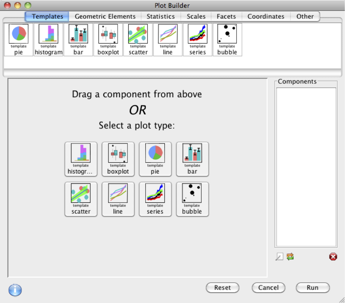
After selecting the Plot Builder menu item from the Plots menu on the menu bar of the Console window, a version of the following window will appear.

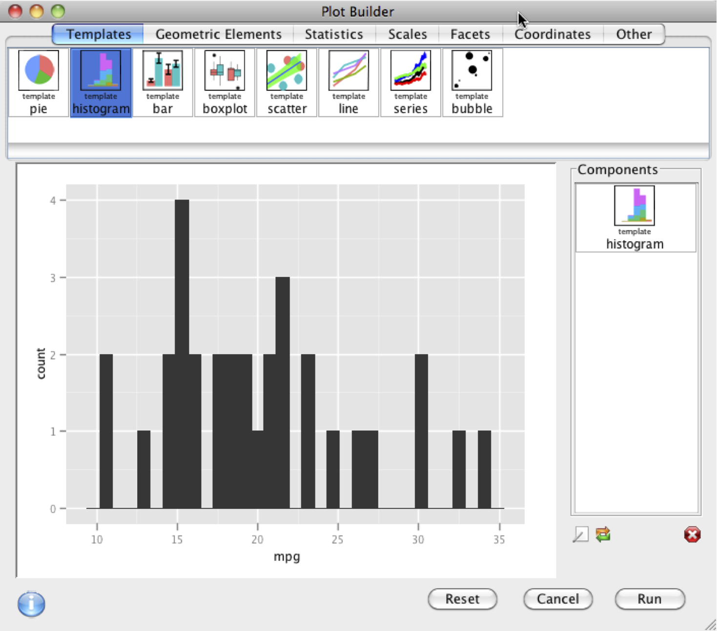
The bar at the top is a series of standard plots (bar, grouped bar, histogram, etc.). When one of these are dragged onto the plot area below, a dialog will appear allowing you to specify which variables you would like to visualize. For example, if you have the mtcars dataset loaded (type in the console: data(mtcars)), drag the histogram icon down, select the mtcars data set, select variable mpg.
Clicking okay will plot the histogram, and add an item to the component list on the right.

Double clicking on histogram in the component list allows you to edit your plotting options.
Hitting Run will run the R code that generated the plot in the console, and launch the plot in a separate graphics window.
The fundamental model behind building plots is the grammar of graphics, as implemented by the ggplot2 package. The plot is created layer by layer, with components dragged from the lists at the top onto the plot, which adds them to the list on the right, and alters the plot accordingly.
Some components add new features to the plot:
Others components alter the characteristics of the plot:
The huge advantage of the grammar for a GUI is that though there are a finite number of components, almost any possible statistical graphic can be produced. Leading to a very flexible tool.
Plots can be saved in the plot builder by going to the File > Save menu item. This will save the plot along with the data used to create it. Saved Plot Builder plots use the file extension .ggp, and can be loaded later by going to File > Open when the Plot Builder is open.
The following video examples should provide some idea of how the builder works: